Exploring with cross filters
Cross filters are one of the most powerful tools Graphext offers. They are natural to use, as they show the distribution of your variables, but enable exploration on different combinations of values, making the whole interface reactive. For example, in this dataset holding transactions from an e-commerce, we can filter those transactions made between 2020 and 2022: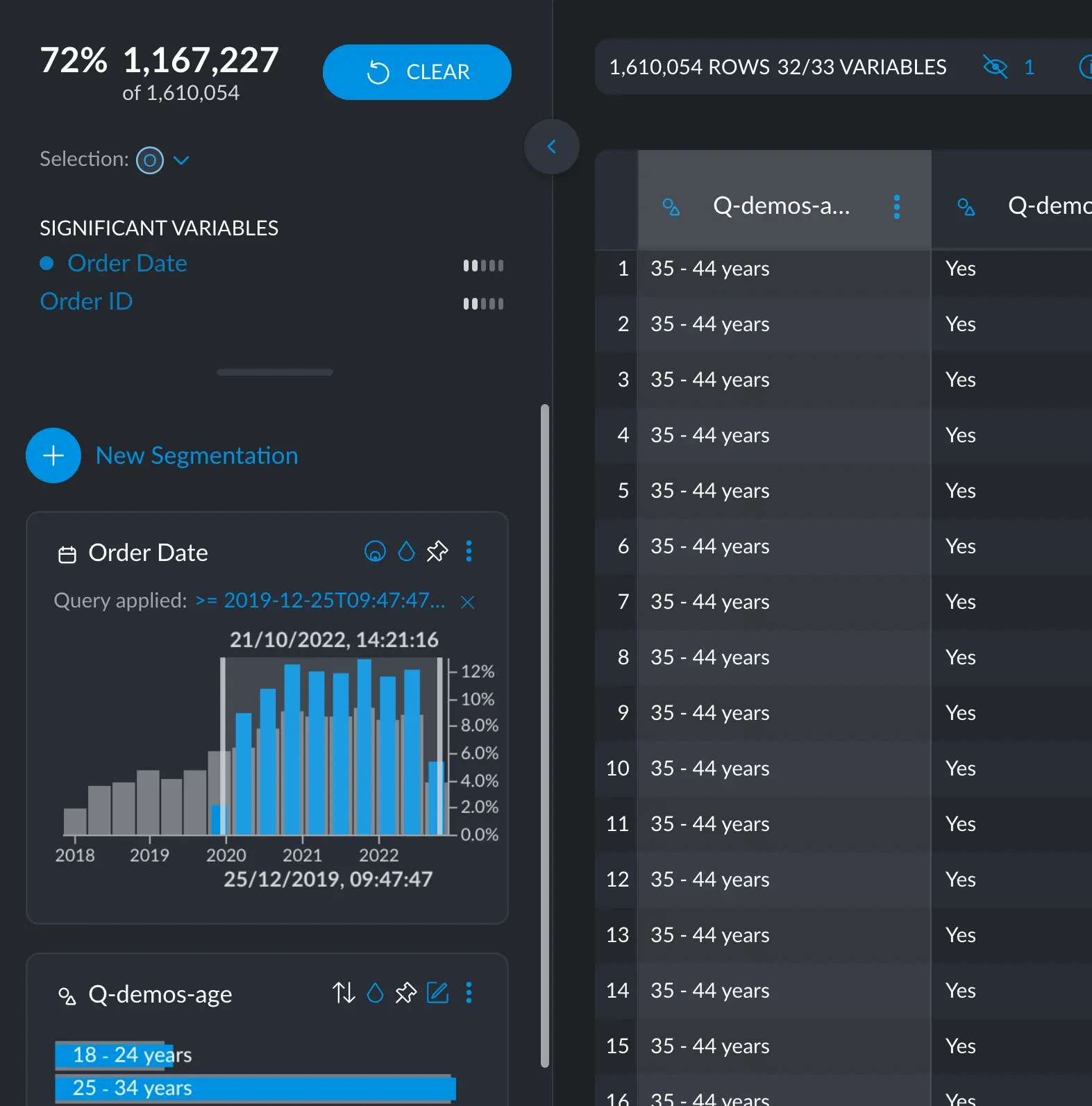
Sorting and filtering
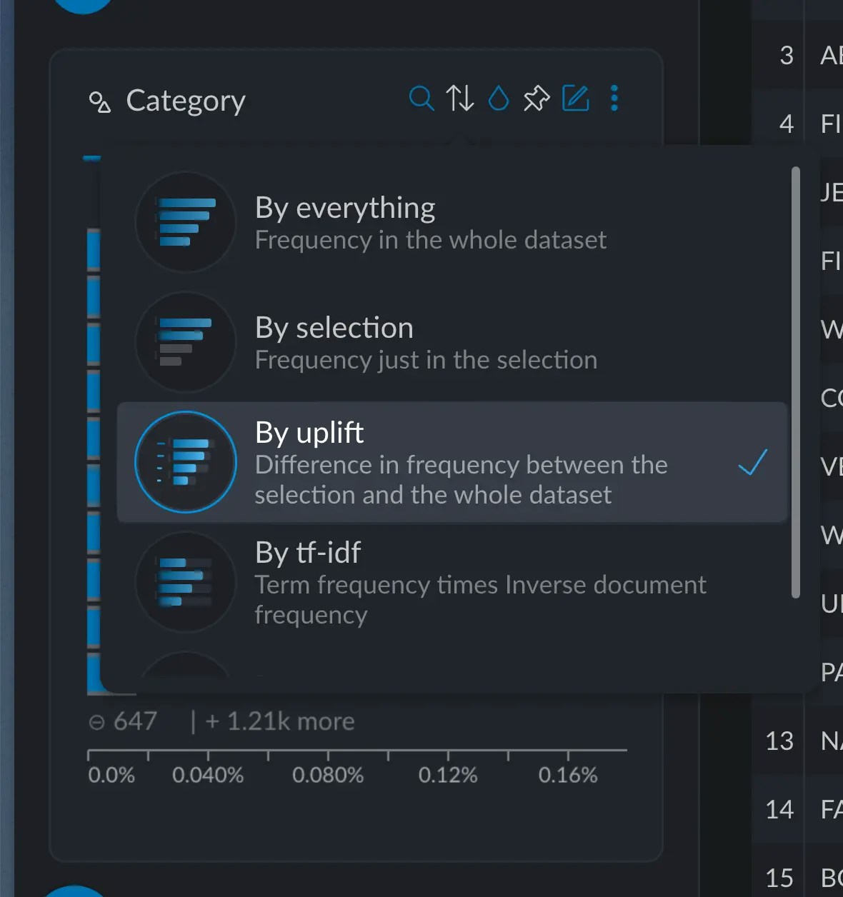
Cross filters can also be sorted and searched, making surgically precise questions a breeze to answer.Sorting
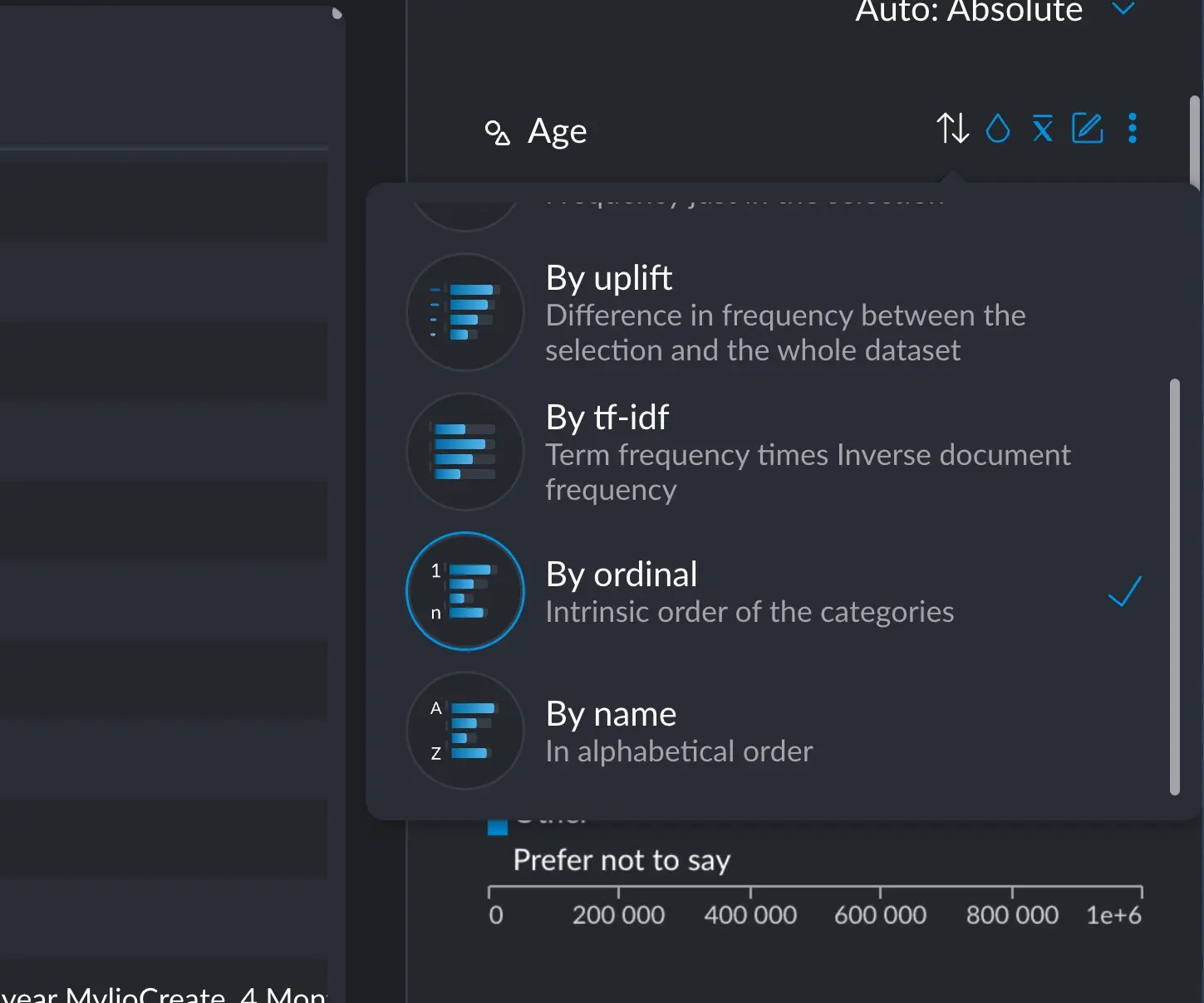
You can sort categorical and text variables, in several ways. The default is “by everything”, which just means the frequency of each value sorted in descending order; the most common items appear first. You also have these other methods available:- Selection: the same as “by everything” but just taking into account the current active selection
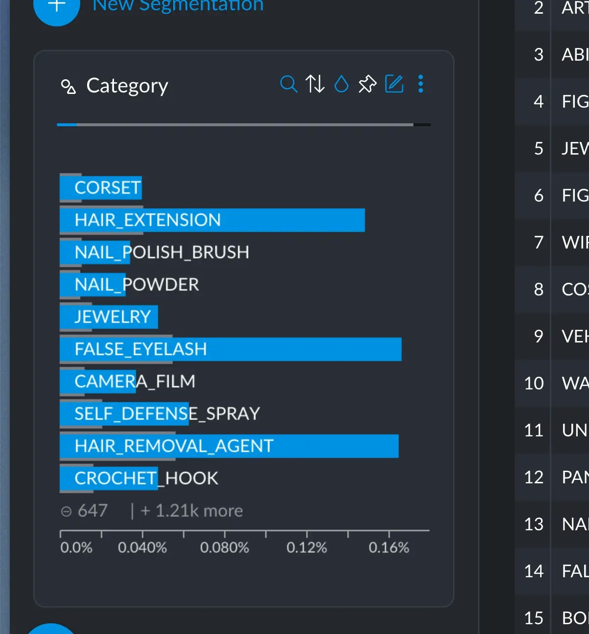
- Uplift: the difference in frequency between the selection and the whole dataset. Bigger differences will appear first.
- TF-IDF: measures the importance of a term (or category) with respect to the whole dataset.
- Ordinal: if you have provided ordinal information to your variable, you can sort it this way.
- Alphabetically: sort the categories alphabetically in descending order.
A practical example
A practical example
For example, say we select this specific demographic of women between the age 18 and 24.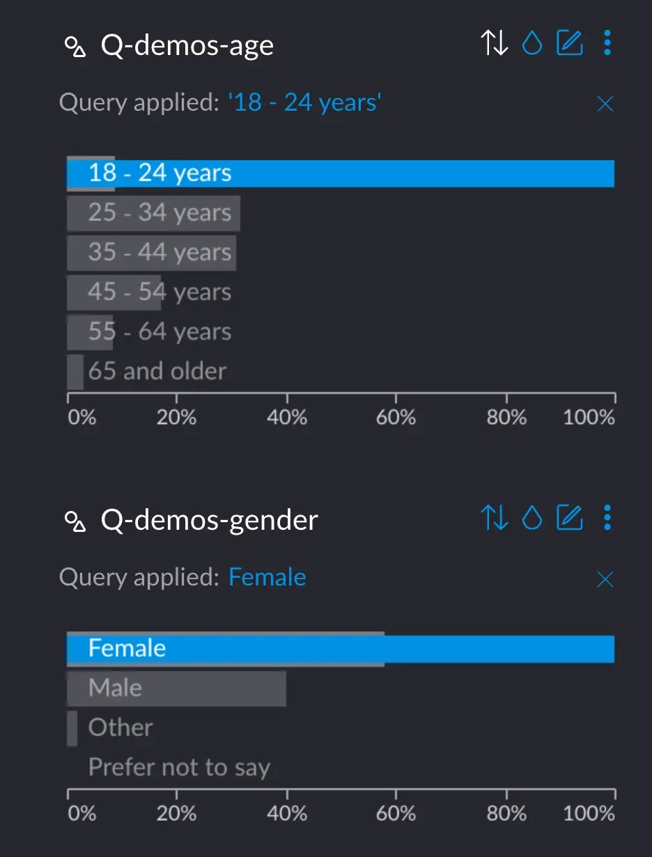
Selecting
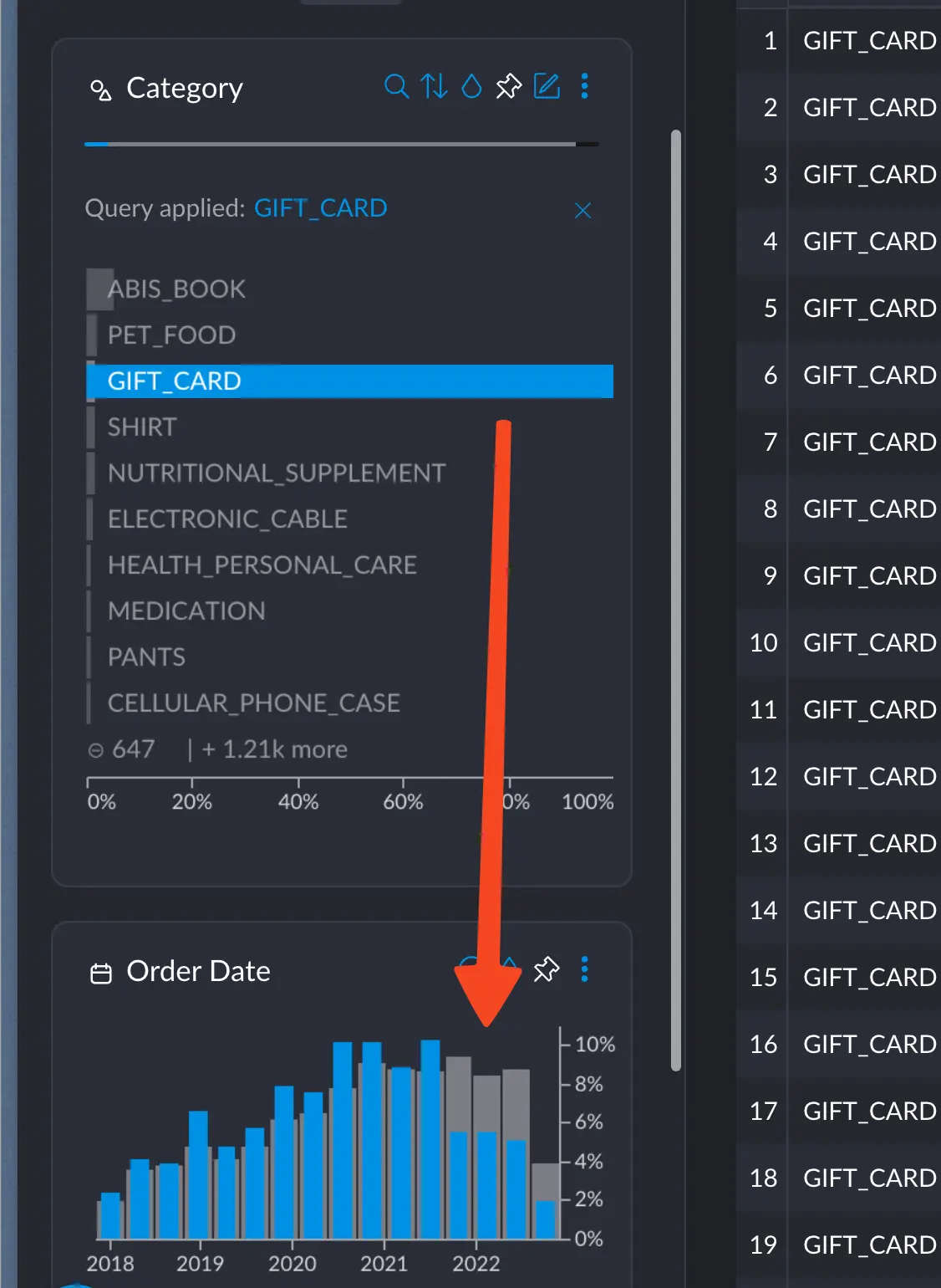
Clicking the little magnifying glass in a cross filter will allow you to search through the different values it holds: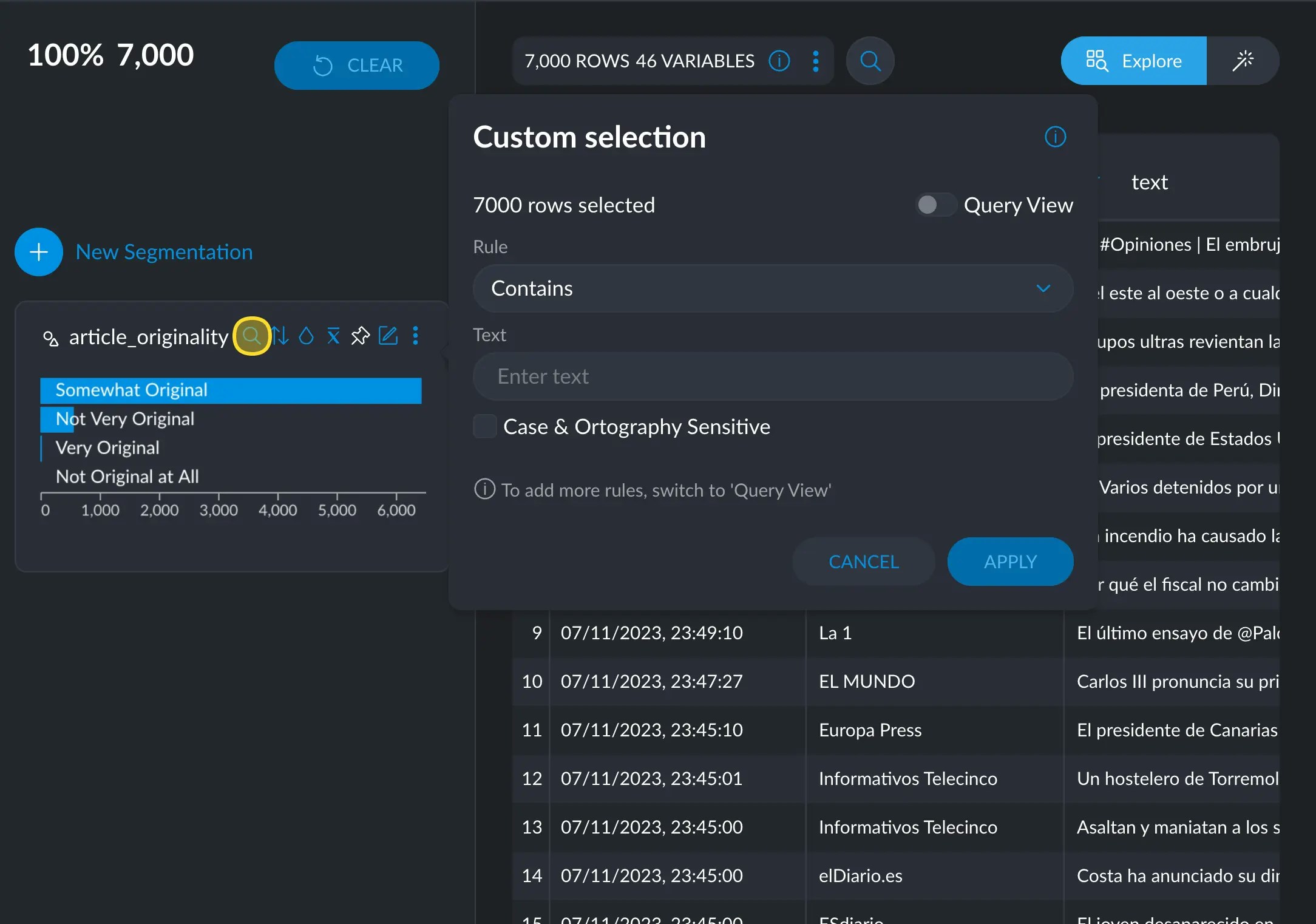
text or
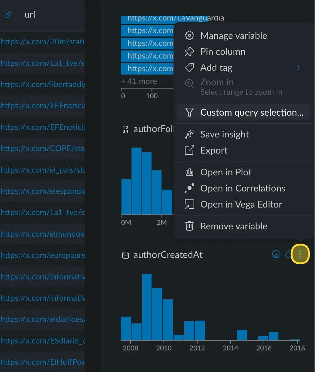
category. In numerical or date variables, you can access it via the options
menu → Custom query selection.