Interface Overview
The Chart Builder is designed to facilitate the creation of various chart types for data visualization. Below is a breakdown of each element present in the interface: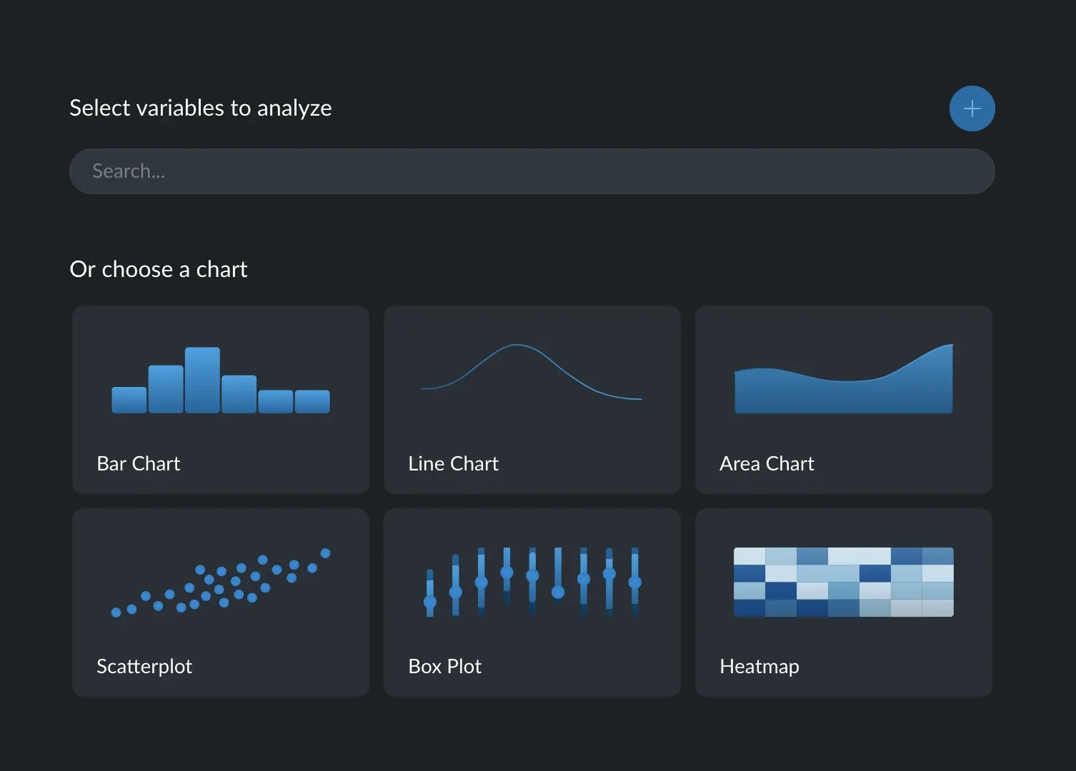
1. Select Variables to Analyze
- Search Bar: Allows you to quickly find and select the variables you wish to analyze. You may type the name of the variable into the search field.
- Add Button (+): This button, located on the right side above the chart options, allows you to add additional variables to the analysis.
2. Choose a Chart Section
This section provides a gallery of chart types to choose from. Each chart option comes with a representative icon and is selectable to create that specific type of visualization. Each chart comes with a set of more complete variants. To explore the different variants available for each chart type, simply hover your cursor over the specific chart’s card. Each variant is symbolized by a unique icon. For instance, when you hover over the ‘Bar Chart’, you’ll see variants like ‘Stacked Bar Chart’ or ‘Grouped Bar Chart’.Two ways of creating a chart
There are two different ways to creating a chart:- Guided: when you have identified the variables you wish to visualize, but haven’t decided on the specific chart type.
- Off-road: when you have a specific chart type in mind, and you want assistance in the selection of variables.
Guided way to create a chart
To begin, locate the input at the top and identify the variable(s) you wish to analyze. You can choose to focus on one or multiple variables, with the option to add more using the ‘Add Button’. Upon introducing the variables, Graphext will automatically generate a chart recommendation. This is based on several factors such as the type of variables, cardinality, and distinct characteristics (for instance, whether the numbers are discrete or continuous, or if the categories have a predefined order). These recommendations will be displayed immediately on the cards. The most suitable chart variant will be prominently displayed, while the variants incompatible with the selected variables will be disabled.You can determine why a specific chart is disabled by simply hovering over it.