Scatter plots display points that are scattered throughout the layout, according to the two variables we are displaying. This makes it very easy to spot correlations in your data; i.e when a variable changes based on the changes of another. There are 4 kinds of scatter plots available in Graphext:
- Scatter Plot
- Colored Scatter Plot
- Bubble Chart
- Bubble Colored Chart
Scatter Plot
The simplest form of scatter plot. Map datapoints in two dimensions. This example makes it easy to understand how they work. We plot a little dot for each football player. The position of the dot depends on their weight and height. This gives a very clear picture on how the two variables are related. If the player is taller, it is also generally heavier, as one might expect. More mass weighs more.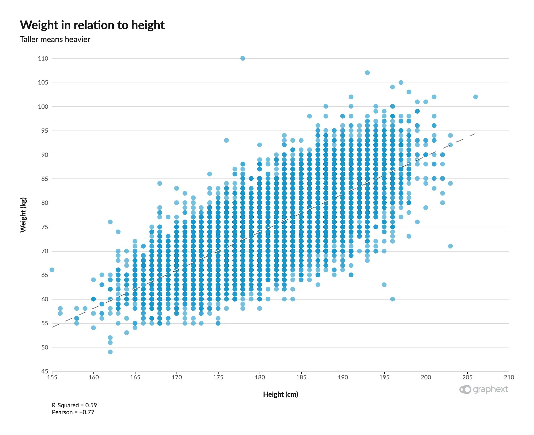
Colored Scatter Plot
A colored scatter plot goes a step further and takes in another variable into consideration, using color to display it. Here we have the same example, but now dots are colored based on the overall skill of the player. We can see that the best players are neither too short nor too tall; and something similar goes with the weight. Excellence lies in the middle. Aurea mediocritas.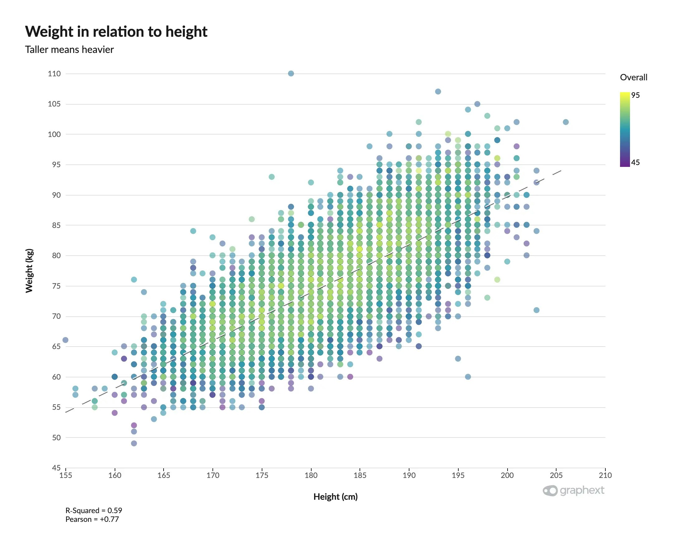
Bubble Chart
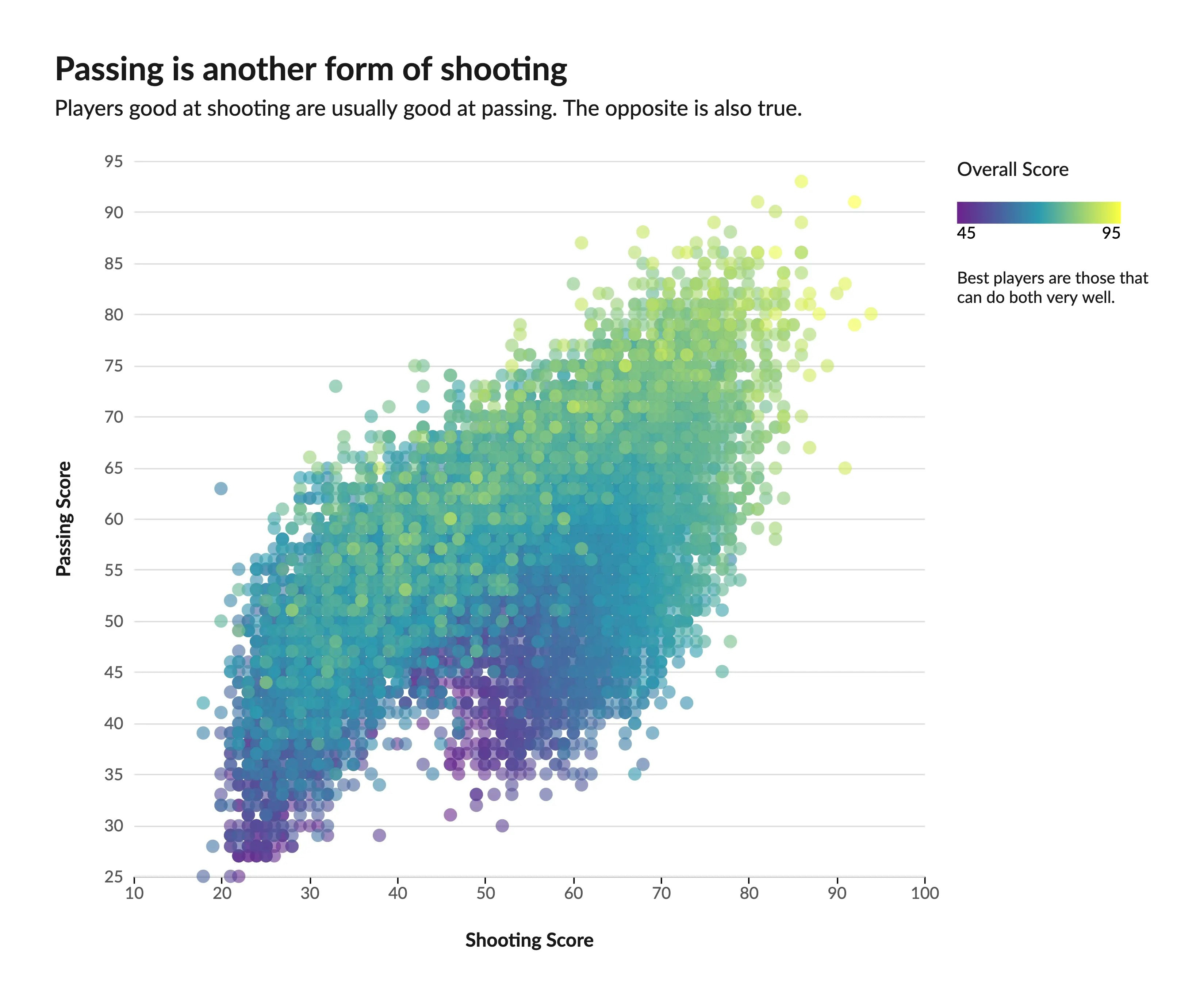
Bubble Charts, on the other hand, deal with the size of the dot to represent another variable, instead of color. Here we can see that larger dots tend to cluster around where the score for shooting and passing is better, giving us a hint on how these two skills affect the salary of a given player.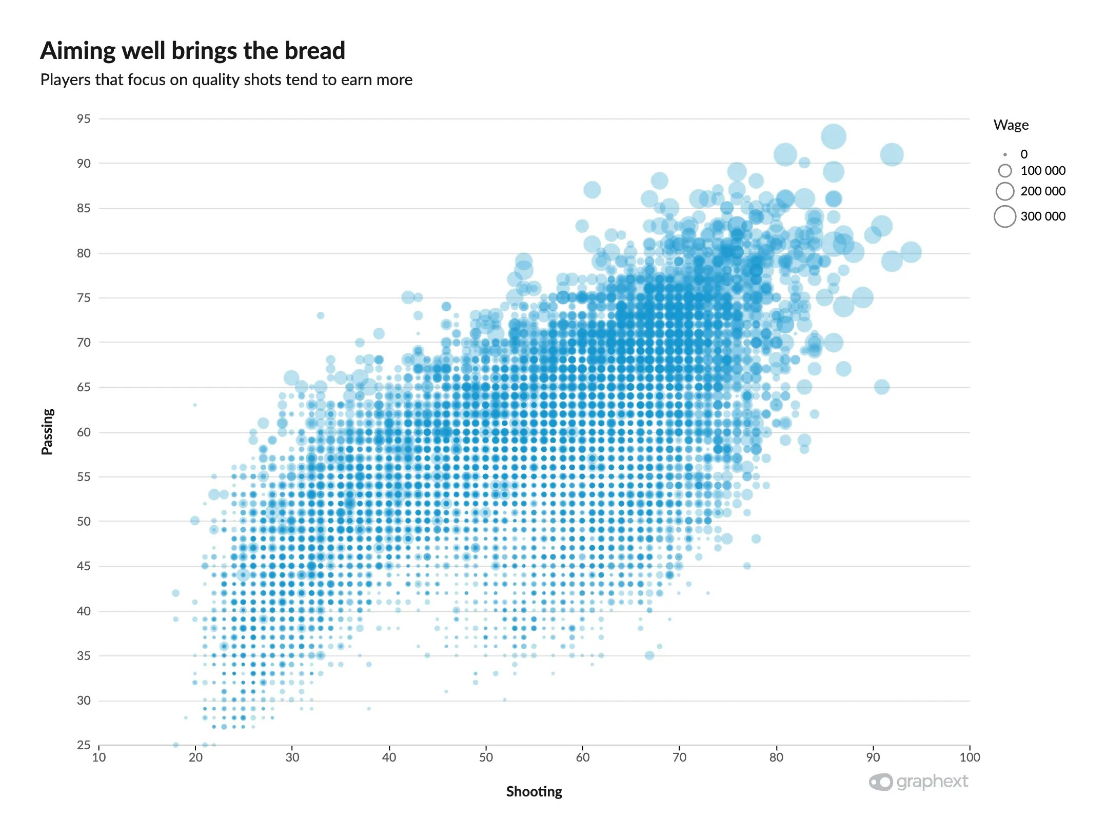
Colored Bubble Chart
Finally, the last logical step would be to also add color to the bubble chart, representing 4 variables in one sitting. We can see in this last example that even though the two skills can bring you more money, not all great players earn the same. And, on top of that, being “great” is not only measured from your shooting and passing skills, as one would expect.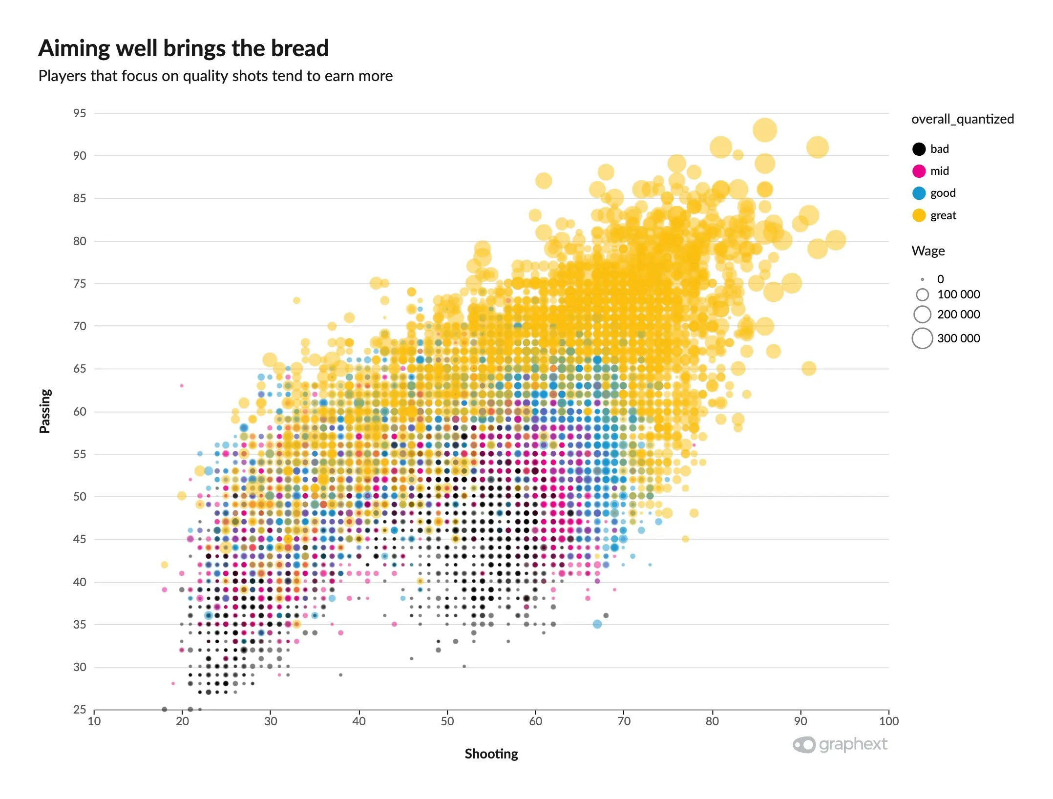
Customizing Scatter Plots
Scatter Plot customization is a bit different than the rest of the charts. Scatter plots allow you to change dot size, opacity, and color, if available.Dot Size & Opacity
The dots’ size can be customized through the Size slider, if available. Their opacity can also be tweaked, useful when we have a lot of overlapping between many data points. Lower opacities allow us to see where datapoints cluster more.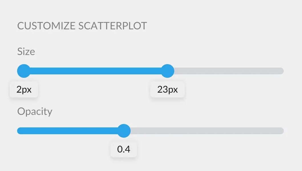
Color
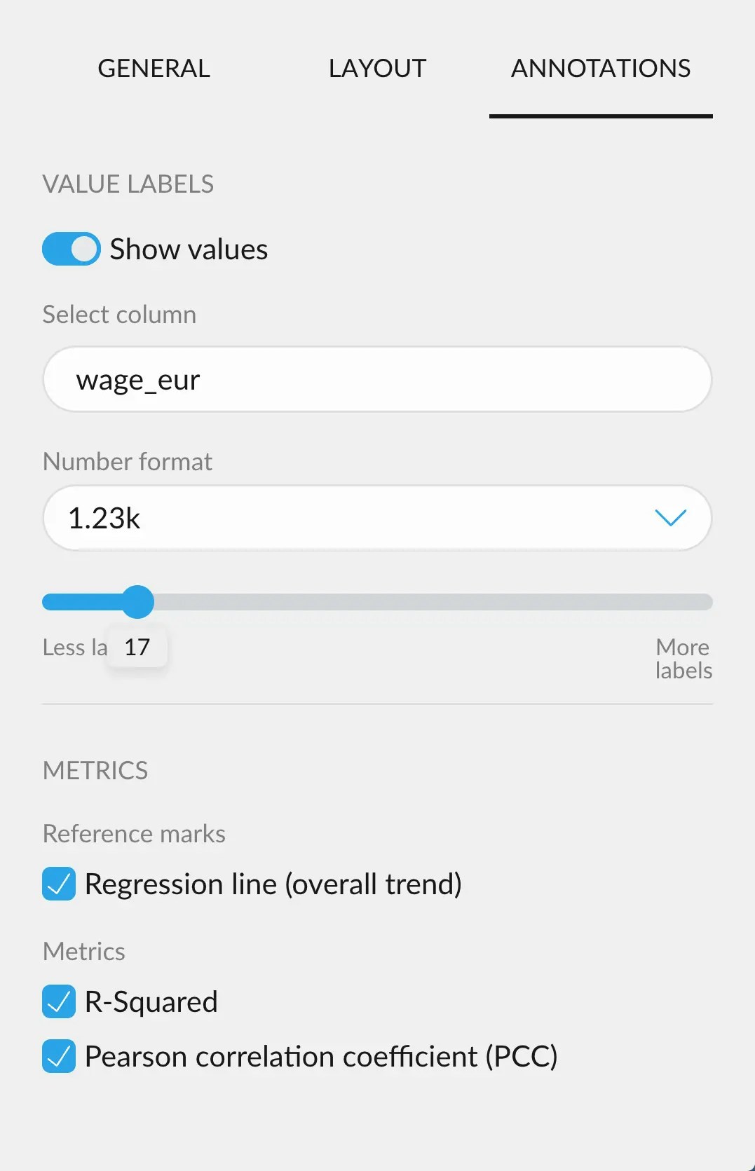
Color customization for scatter plots works in the same way as with any chart. You can learn more here: Customizing colors in a chart.Annotating Scatter Plots
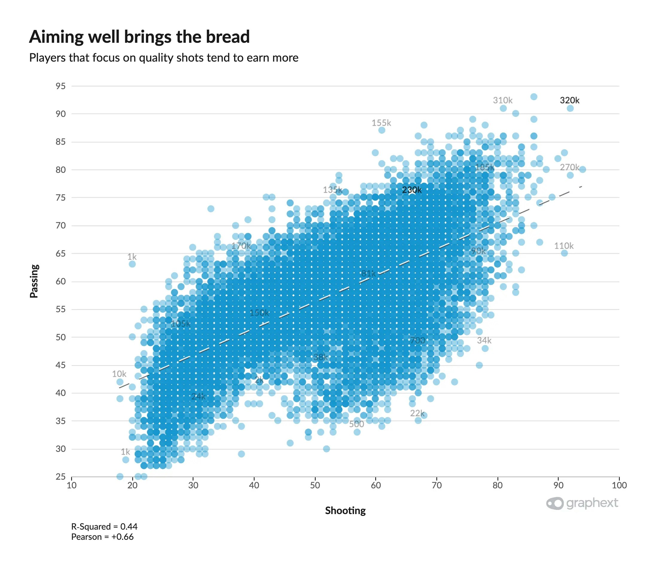
- Show regression line, which fits a line with the least squared error
- Show the R-Squared value, that will appear in the footer of the charta
- Show the Pearson Correlation Coefficient, next to the R Squared value.