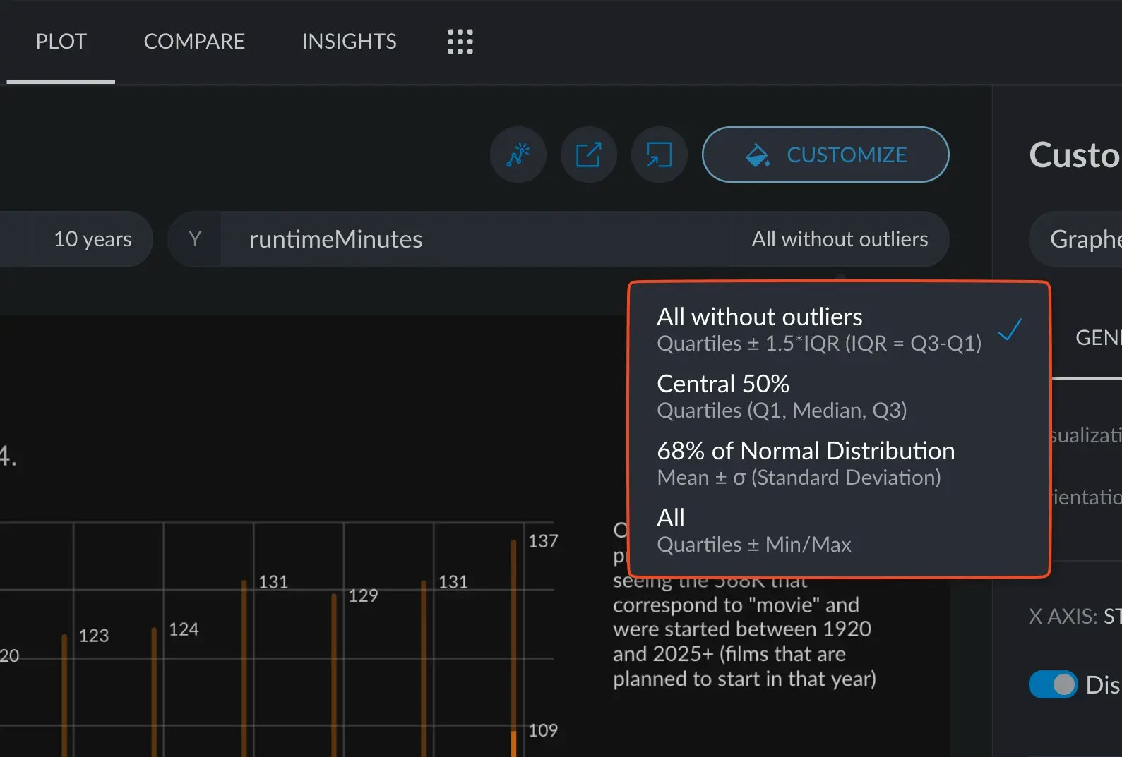
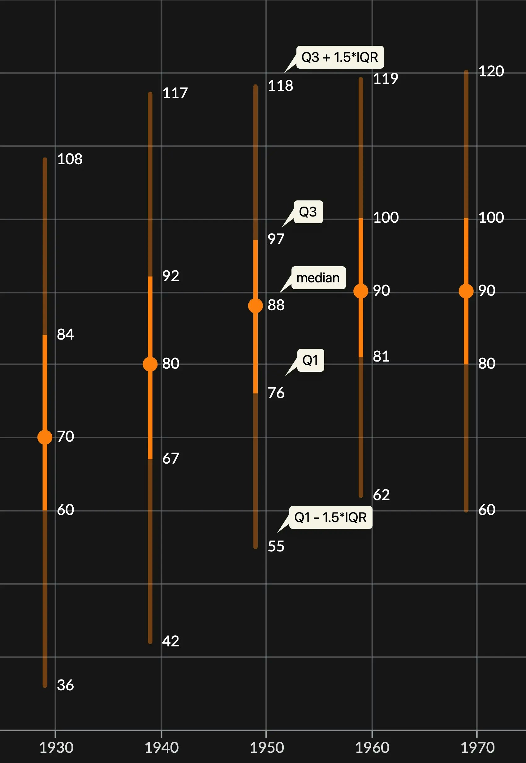
Box plots, or also known as whisker plots, are great at summarizing distributions across categories in your variable. They represent the most important splits along a given distribution in your data: the quartiles. In Graphext, we also represent values that extend past the interquartile range, showing the spread that occurs above and below it.
Customizing Box plots
Box plots are relatively simple charts on their own, and, as such, not much configuration can be made apart from coloring the bins and changing the axes settings.Color
Color customization for box plots works in the same way as with any chart. You can learn more here: Customizing colors in a chart.Axes configuration
When customizing a box plot, the dependent variable will have custom options to represent different sections of the whole distribution, such as the whole range of values, including outliers, or statistically important sections of it.