Temperature in Madrid 1920–2022 • Multiple Line Charts • Google Charts theme
Line charts are the most popular type of chart for visualizing change over time and detecting temporal patterns. While not exlusively used for that, it’s where they really shine. In Graphext, you have 4 subtypes of line charts to choose from:
- Simple Line Charts
- Multiple Line Charts
- Segmented Line Charts
- Seasonal Decompositions
Simple Line Charts
The simplest form of a line chart. Shows the progression of one variable over the other.Multiple Line Charts
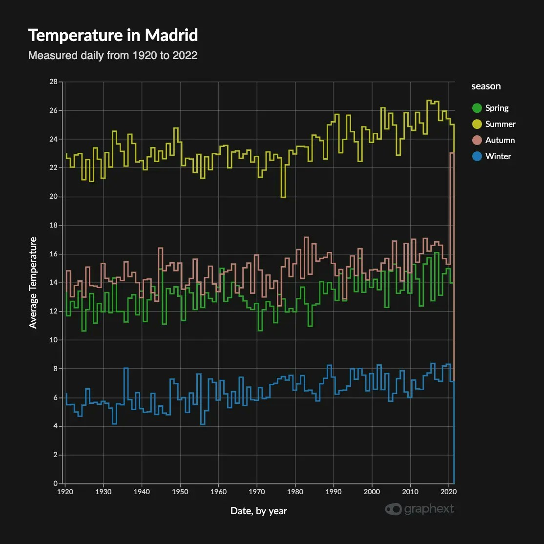
Multiple Line charts allow to see how different variabes change over time, offering a broader perspective. Again, these are usually used to show how multiple trends change over time. They take one more variable, which would be mapped to a new line with a new color.Segmented Line Charts
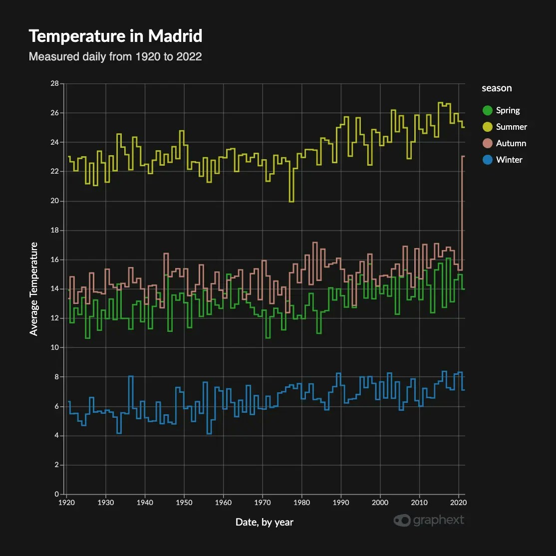
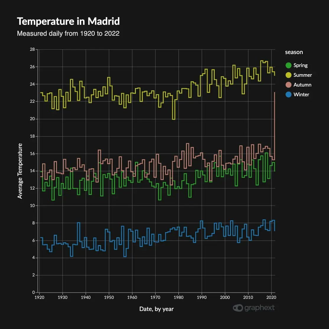
Segmented Line charts also show multiple variables but do so in separate charts. These are also known as faceted line charts, or faceted charts, in general. These are useful when you want to measure change on different variables but each variable doesn’t necessarily respond to the same Y scale. Think a computer resources dashboard, displaying CPU usage, RAM and Network.Seasonal Decompositions
Seasonal Decomposition charts are a type of Segmented chart that displays the different temporal components your data presents, such as trend and seasonality. We can see in this example from measurements of the temperature of Madrid from 1920 to 2022, how the original data can be decomposed into its trend and seasonality components. The trend has been rising steadily, but we can see a particular bump around 1975 and onwards. Seasonality is also quite descriptive of the 4 seasons that occur, even when considering a 10 year window.Expanding charts
In the Seasonal Decomposition Charts you can expand each of the individual plots to a full-scale version of it, for increased clarity.Customizing a line chart
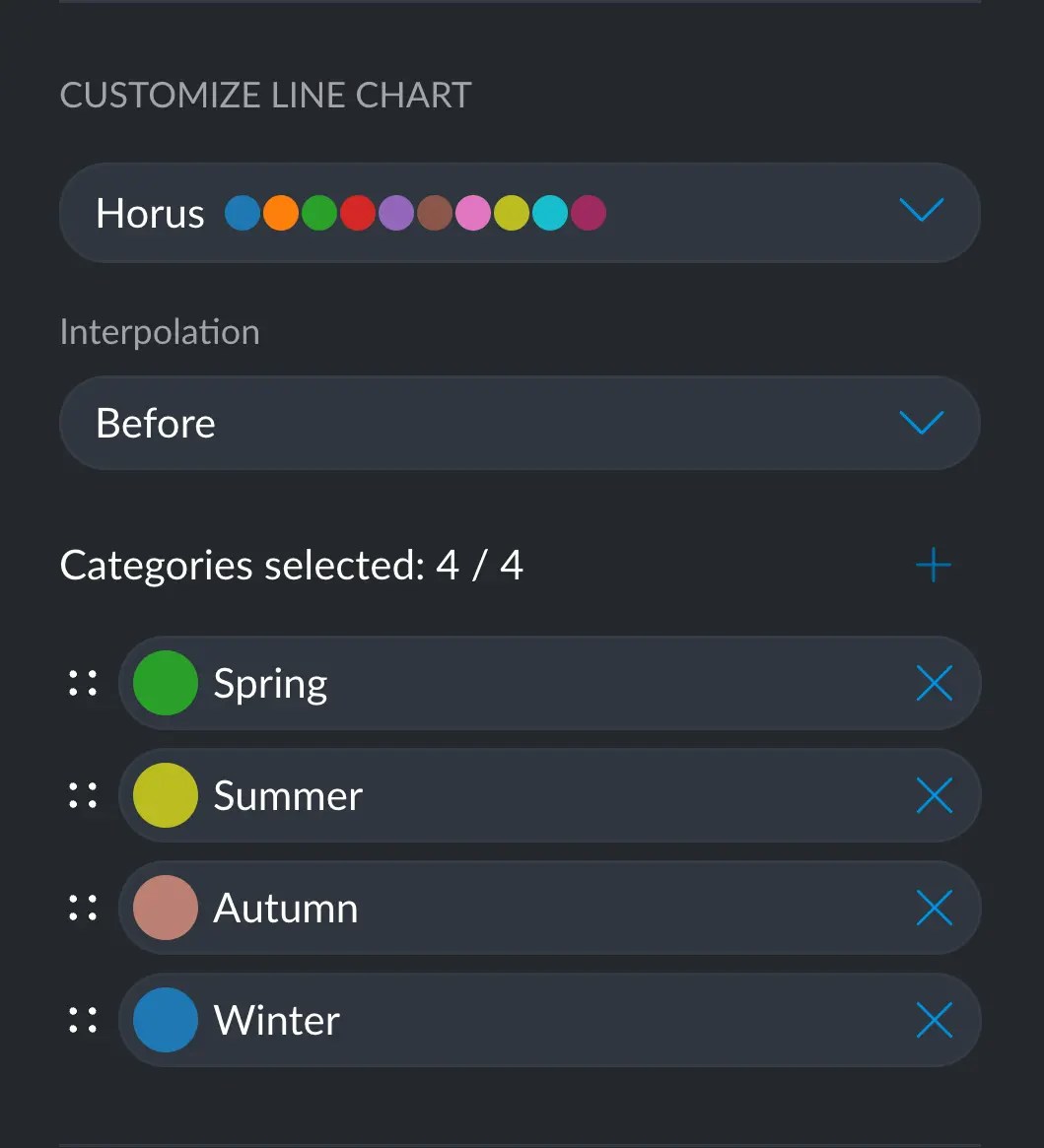
Color
Color customization for line charts works in the same way as with any chart. You can learn more here: Customizing colors in a chart. You can change the color of each line by either selecting a color palette for all lines, or changing a specific category for a more semantically accurate color. For example, in here we can have a yellow summer and a brownish autumn, which makes it that much easier to identify at a glance. You can change a specific color by clicking on the colored circle next to the desired category.When selecting a specific color for a category, this decision will take over
any color palette/theme choice. That is: the colors you set manually will
prevail over any other way of changing colors.
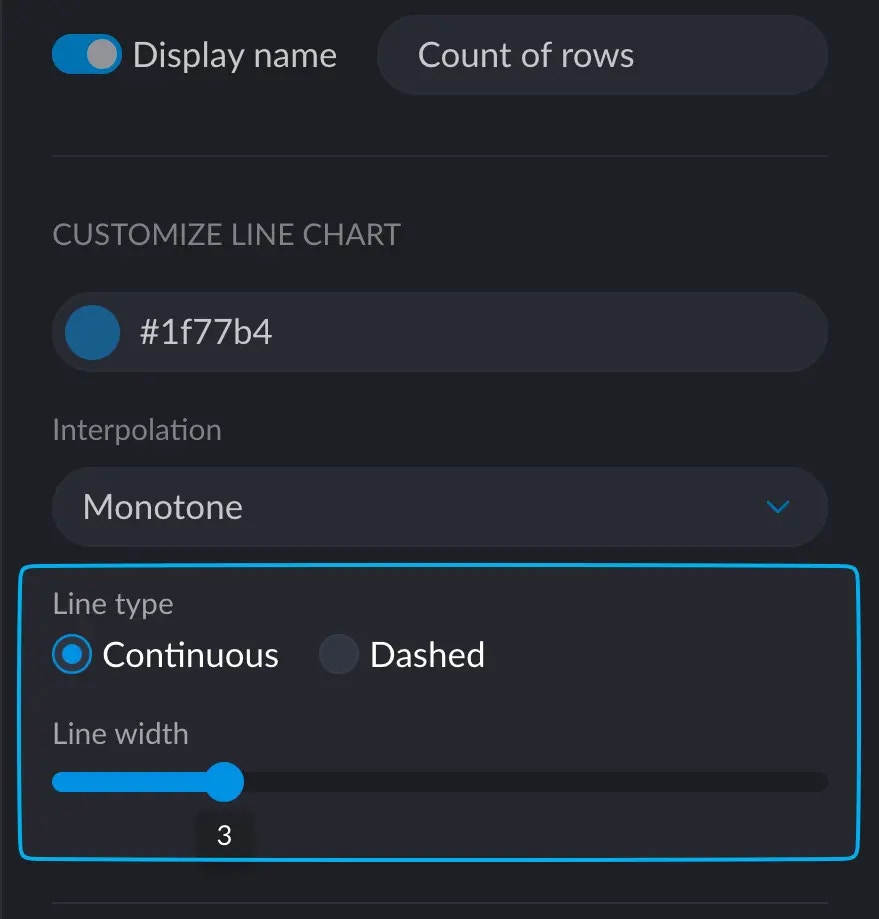
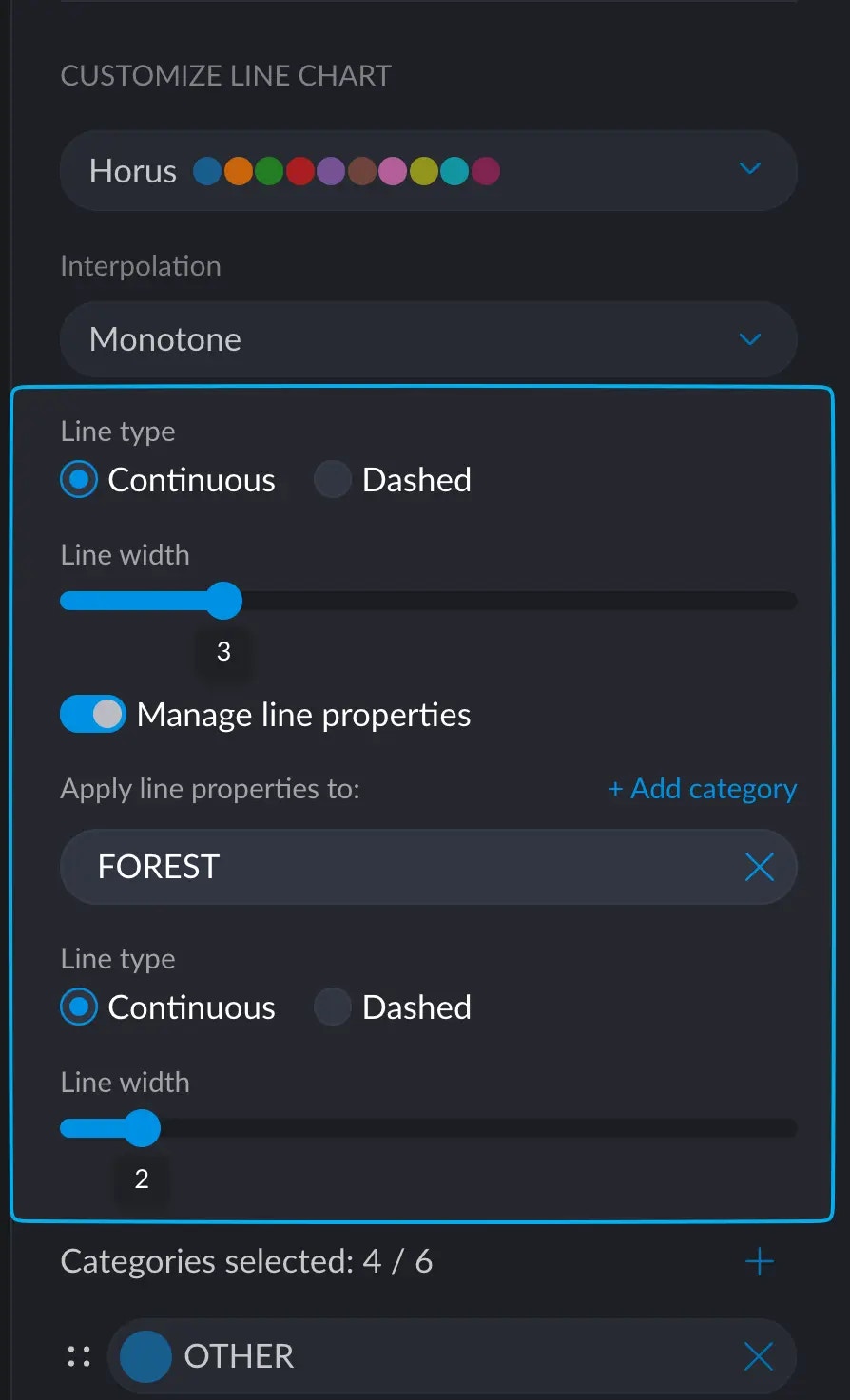
Line thickness
Interpolation
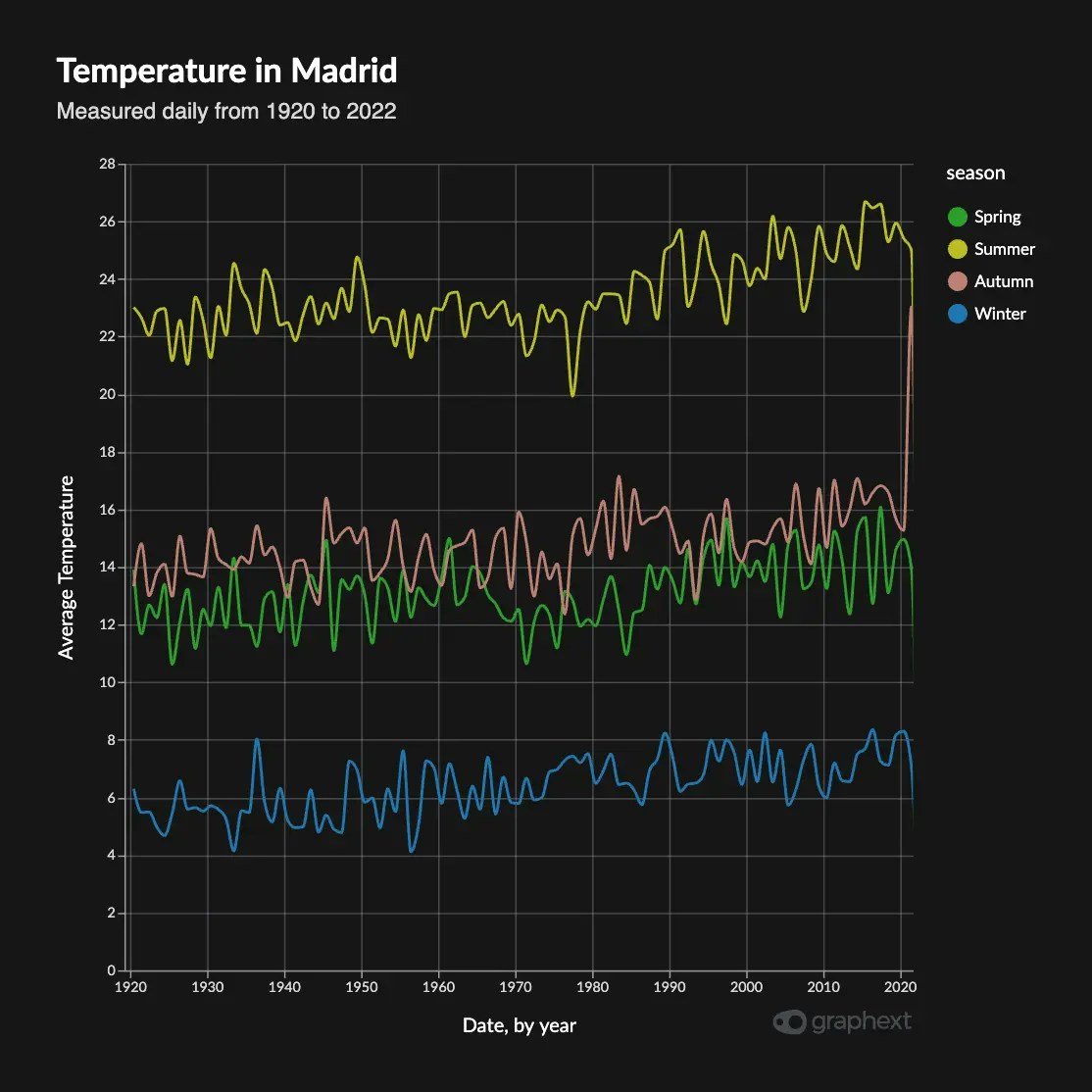
Interpolation on all Line Charts can be changed between these modes:Linear Interpolation
Classic straight-line interpolation between any pair of points.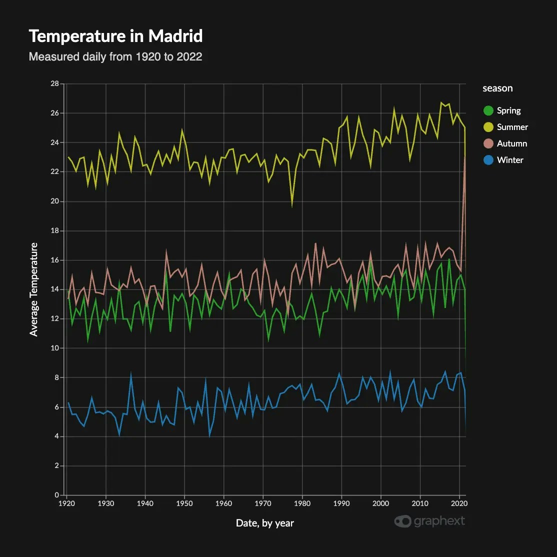
Linear Interpolation
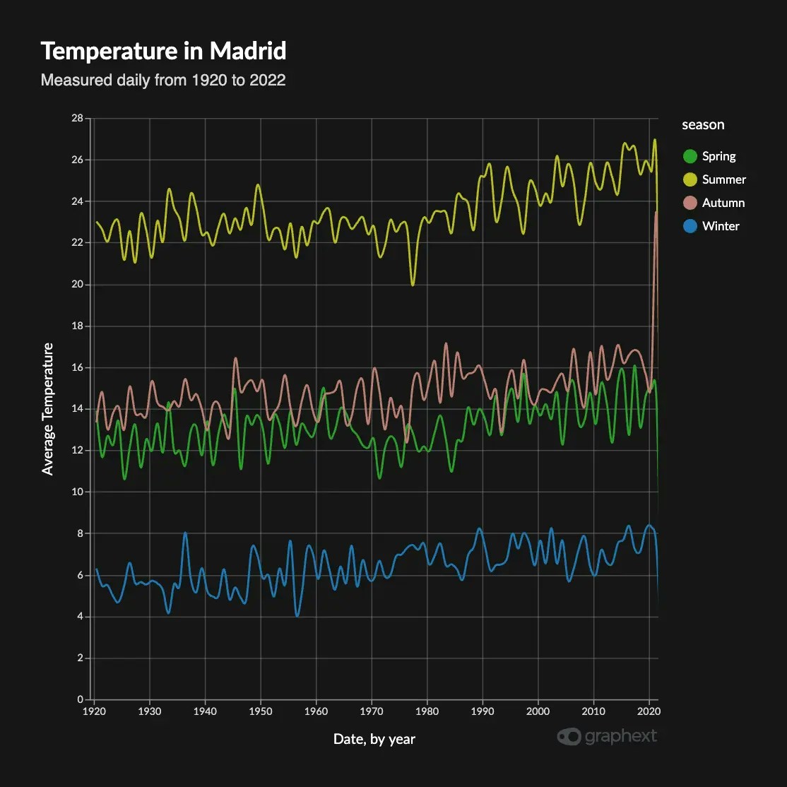
Curve Interpolation
Defines a curve between any pair of points, making the overall result look smoother. You can choose between Monotone, Cardinal and Natural interpolation.- Monotone Interpolation
- Cardinal Interpolation
- Natural Interpolation
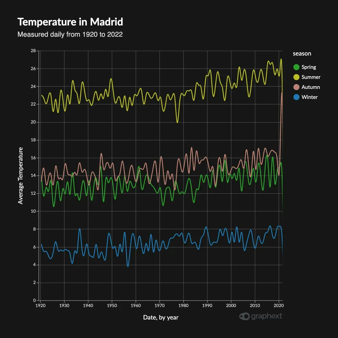
Step Interpolation
Step interpolation is, basically, no interpolation. It creates sharp corners and straight vertical lines between the points. These are useful when it makes no sense to interpolate between two points, but just want to see the difference between them. Step has three modes: Before, Middle and After, which define the anchor point with respect the actual data point.- Step Before
- Step Middle
- Step After
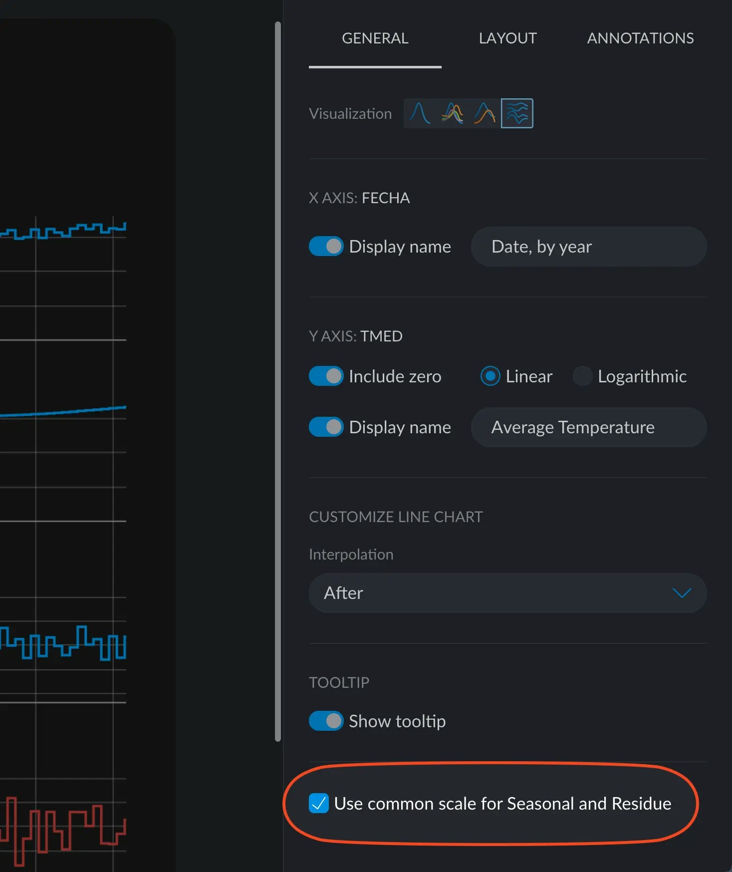
Seasonality Decomposition: Common Scale
In Seasonality Decomposition Charts you can enable a little check box at the very bottom that toggles between the season and the residue charts having a common scale.