Bar Charts are, arguably, one of the most popular types of chart. They represent relationship between variables in a very clearly visual way, allowing to compare the height of each bar. This makes it very easy to spot changes in your data. There are 5 kinds of bar charts available in Graphext:
- Simple Bar Chart
- Grouped Bar Chart
- Stacked Bar Chart
- Stacked Relative Bar Chart
- Segmented Bar Chart
Simple Bar Chart
We know how this goes. A particularly useful, albeit common, use of bar charts is using one axis to measure the number of ocurrences in your data. In this example, we count how many of the credit card transactions belong to a given category and we plot that number.Grouped Bar Chart
Grouped bar charts can display all the combinations between the values of two variables. This allows for a great way of providing a ton of information at a glance. We can see in this example that we have a variable “Overall skill” which holds the values “bad”, “mid”, “good” and “great”, and another variable “Wage bracket”, which holds the values “low”, “mid-low”, “mid-high” and “high”. This chart presents the number of players that lie in each of the 16 possible combinations in a very tidy format.Stacked Bar Chart
Stacked bar charts share a lot of similarities with grouped bar charts, with the only difference that, instead of laying the bars laterally, they are stacked up. The former is better to distinguish small differences in groups, the latter is better suited for a broader perspective on the relatioship between the groups.Stacked Relative Bar Chart
The next logical step is, of course, normalizing the values so that they add up to 1. This gives an even better representation of the relationship in size between each group. We can see how this vaguely resembles a stacked area chart, albeit a bit coarser in nature.Segmented Bar Chart
Segmented bar charts behave in much the same way as Segmented Line charts do. You get a different plot for each category displayed.Customizing Bar Charts
Bar Charts share much of the same functionality with line and area charts.Bar Gaps
The spacing in between each bar can be customized through the Spacing option.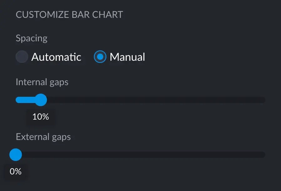
- Thinner bars and big lateral gaps
- No space in between bars