host_since column, which indicates
when this Airbnb host first logged in, different correlations appear.
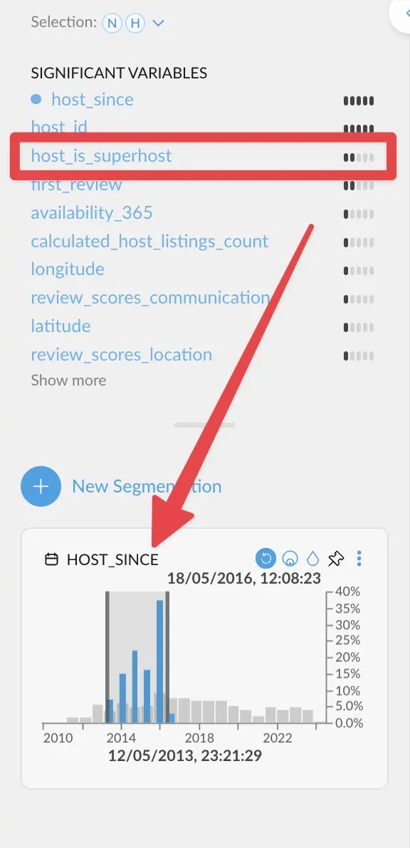
host_is_superhost correlates more strongly. This
means that hosts need quite a bit of time before actually becoming superhosts.
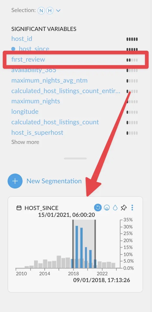
first_review
correlates more strongly instead. Which makes sense, since having a first review is the
most common event among new hosts.
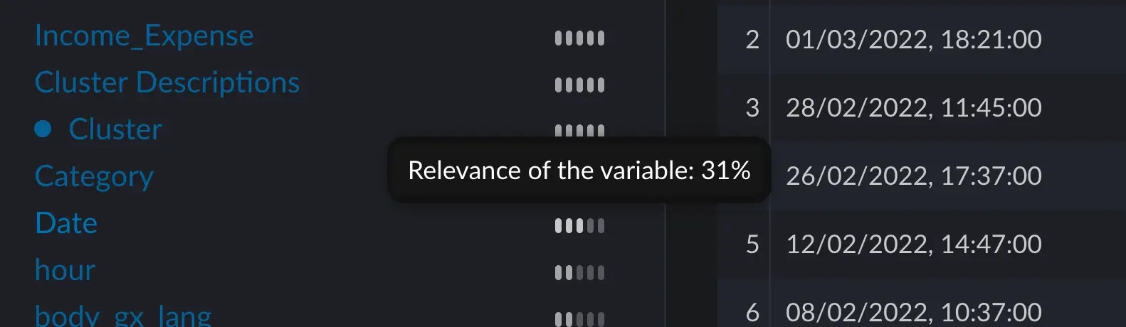
We are skipping the two first entries on purpose. Correlations on an ID column (host_id)
are generally not useful. And a strong correlation against the same variable is also to be expected.
Graphext evaluates all columns anyways!
How is the score calculated?
Manually computing an example
Context
Assume we are on a dataset where, among other things, we have a columnmonth which has the numbers 1 – 12 for each month,
and a column season which has the values “Summer”, “Autumn”, “Winter”, “Spring”.
We all know that Spring happens in March, April and May, approximately. If we select the category “Spring”, we can see
that the months 3, 4 and 5 show up these blue spikes, whereas the rest of the months do not.
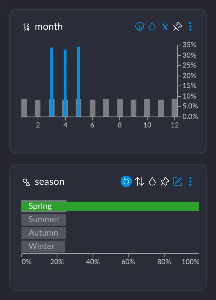
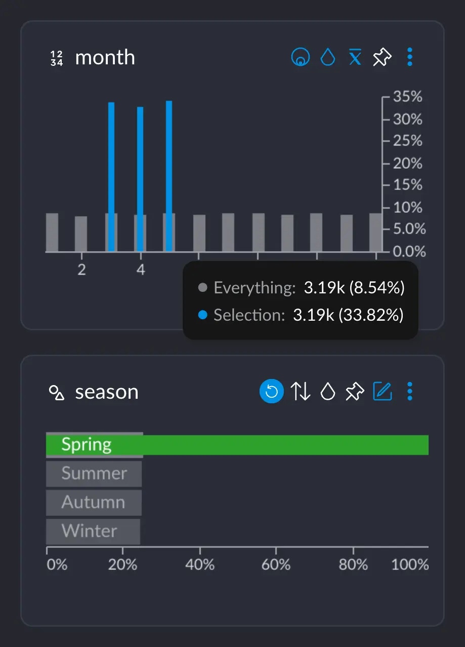
- 3.19K represents the number of rows that have this particular value from this particular column (in this case, the value 5 for column
month). Or, basically, the grey-ish bar behind the blue one. - This 3.19K amounts to an ~8.5% of the whole dataset, which has ~37.3K rows.
- Importantly, these 3.19K rows correspond to ~33% of all the 9442 rows we selected when clicking on “Spring”. This makes sense: spring spans across 3 months, so May alone has about a third of all the days that comprise the whole Spring.
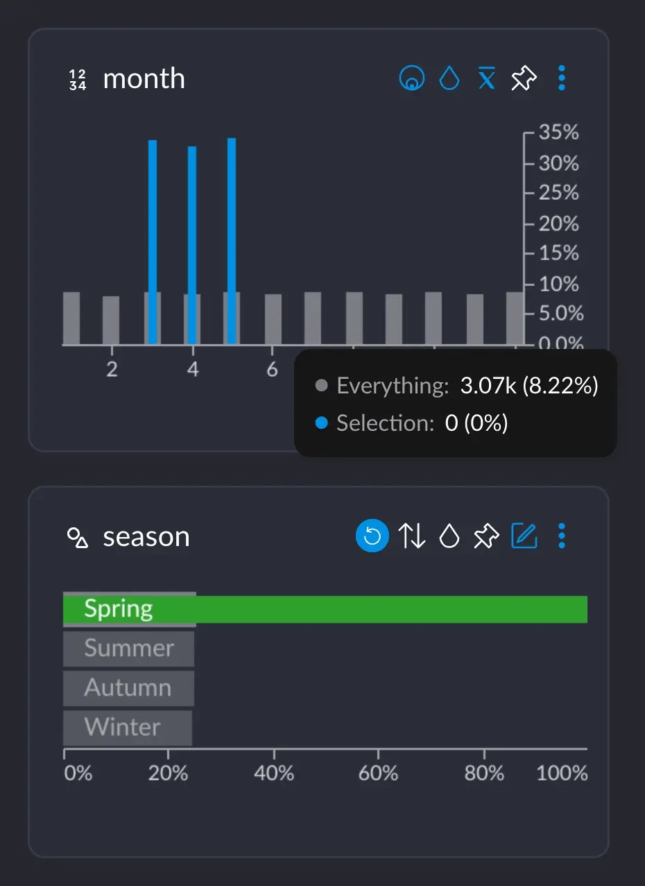
month AND the value “Spring” in season.
Computing
The way we calculate how different the distributions between month and season are would involve going over each of these tooltips, subtracting the two percentage values, getting the absolute value, adding them all up and finally dividing by two. The full operation would look like this.- We add up all the absolute value of the differences:
- Finally, we divide the whole result by 2:
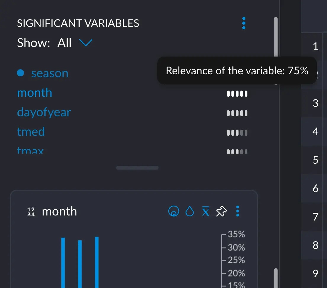
month in the significant variables section:
We are not justifying the math behind this, since this flies a bit out of the
scope for this short explainer. Check the
references if
you really want to dig into the topic.