> ## Documentation Index
> Fetch the complete documentation index at: https://docs.graphext.com/llms.txt
> Use this file to discover all available pages before exploring further.
# Heatmap
> *Looks like I've been digging Vulfpeck forever even though it's only been
> since 2021. It appears as though I'm much more interested in Antonio Lizana
> now, which I would agree with. I guess I cannot argue with the data.*
>
> – Jesús
***
Heatmaps show proportions of occurrences in your data in a grid, where each cell indicates visually how
the proportion for that particular intersection of categories looks like.
This relationship can be customized in Graphext, configuring the Cell count.
## Customizing Heatmaps
### Cell count
The cells in the heatmap can represent several types of aggregations of your data.
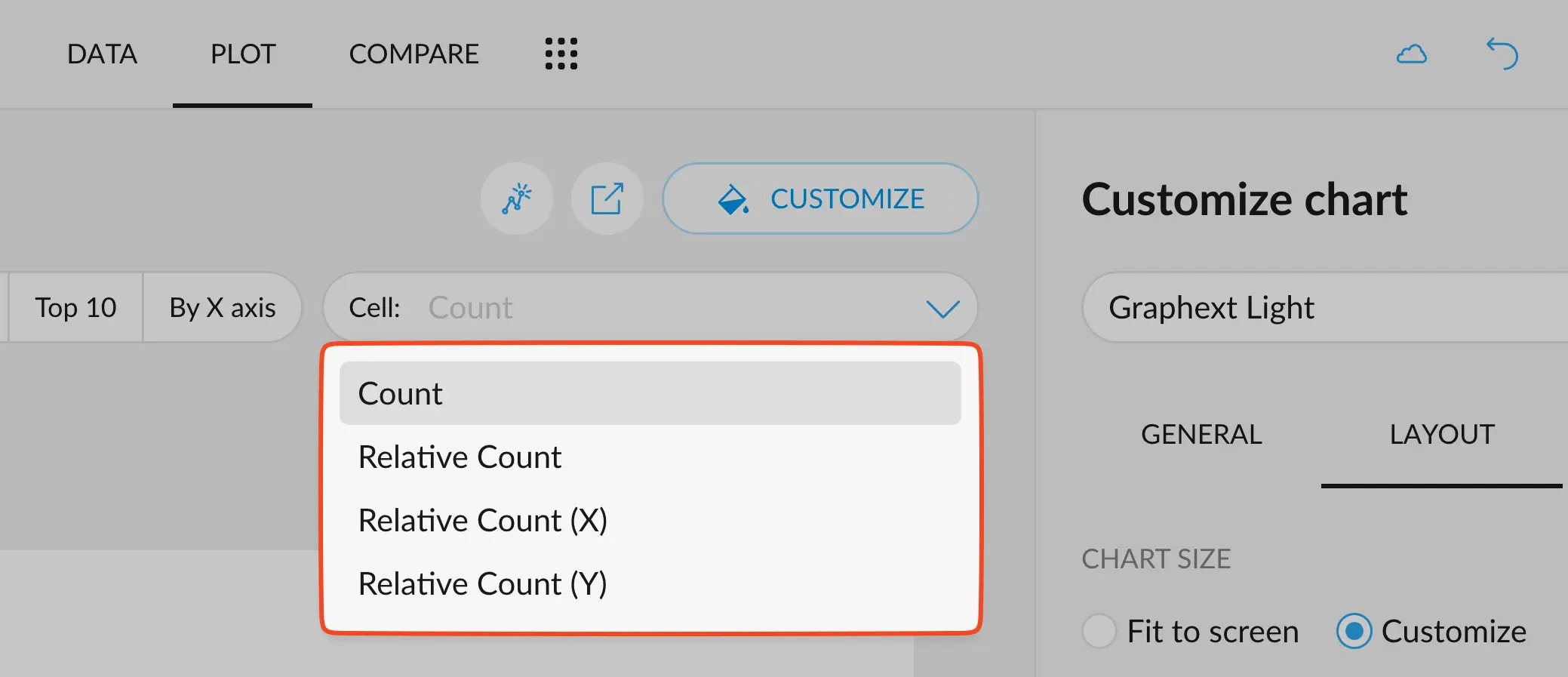 Let's analyze the different options with the same example as the one in the header.
#### Count
Count gives the absolute number of rows that correspond to any given combination of categories
of the two variables used. The top-left corner of this table displays `131`, which corresponds to
the number of rows that both have their year as `2020` and artist as `Vulfpeck`, after all the filters
have been applied.
We can see that's easy to spot important numbers as cells "light up" more proportionally to the number they hold.
#### Relative Count
Relative count normalizes the visible values to add up to 100. That is, the "bluest" cell, where there
was a 1.35K before, means that this particular combination corresponds to 3.13% of all streams in
the dataset.
#### Relative Count (X)
However, sometimes it is much more interesting to break down percentages per each axis.
The relative count on the X axis shows the percentage with respect to the total
number of rows that fall in each category in the X axis, and then calculates the percentage.
This means that now we are answering the question: "out of all the streams made in a
given year, how many were towards a given artist?".
For example: out of all the streams I made in 2021, \~33% were listening to Vulfpeck. Out of all the streams I
made in 2024, \~53% were listening to Antonio Lizana.
#### Relative Count (Y)
The relative count on the Y axis, does the opposite: shows the percentage with respect to the total
number of rows that fall in each category in the Y axis, and then calculates the percentage.
This answers the opposite question: "out of all the streams made towards a given artist, how
many were made in a given year?".
For example: \~63% of the streams I made to Jamiroquai happened in 2021.
Let's analyze the different options with the same example as the one in the header.
#### Count
Count gives the absolute number of rows that correspond to any given combination of categories
of the two variables used. The top-left corner of this table displays `131`, which corresponds to
the number of rows that both have their year as `2020` and artist as `Vulfpeck`, after all the filters
have been applied.
We can see that's easy to spot important numbers as cells "light up" more proportionally to the number they hold.
#### Relative Count
Relative count normalizes the visible values to add up to 100. That is, the "bluest" cell, where there
was a 1.35K before, means that this particular combination corresponds to 3.13% of all streams in
the dataset.
#### Relative Count (X)
However, sometimes it is much more interesting to break down percentages per each axis.
The relative count on the X axis shows the percentage with respect to the total
number of rows that fall in each category in the X axis, and then calculates the percentage.
This means that now we are answering the question: "out of all the streams made in a
given year, how many were towards a given artist?".
For example: out of all the streams I made in 2021, \~33% were listening to Vulfpeck. Out of all the streams I
made in 2024, \~53% were listening to Antonio Lizana.
#### Relative Count (Y)
The relative count on the Y axis, does the opposite: shows the percentage with respect to the total
number of rows that fall in each category in the Y axis, and then calculates the percentage.
This answers the opposite question: "out of all the streams made towards a given artist, how
many were made in a given year?".
For example: \~63% of the streams I made to Jamiroquai happened in 2021.