> ## Documentation Index
> Fetch the complete documentation index at: https://docs.graphext.com/llms.txt
> Use this file to discover all available pages before exploring further.
# Significant variables
> A quick peek into potential correlations
Significant variables appear when you [filter your data](/concepts/graphext-concepts/cross-filters). By selecting a date range, a
category or a number range in any of the columns, you are selecting a subset of all
the possible data points you have. Depending on what variable you used, this filter can
be related to some other variable. Those variables that show a strong correlation with
the selected one are **significant variables**.
These appear on the top left side of the interface upon filtering.
You can see in here that when filtering the `host_since` column, which indicates
when this Airbnb host first logged in, different correlations appear.
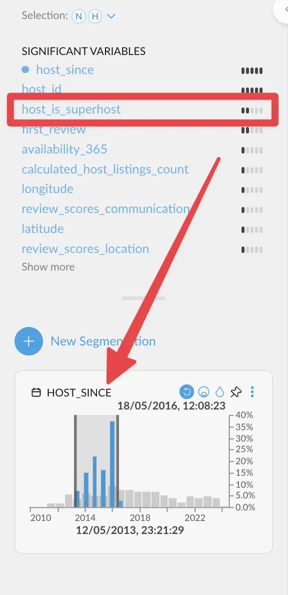 If we filter quite back in time, `host_is_superhost` correlates more strongly. This
means that hosts need quite a bit of time before actually becoming superhosts.
If we filter quite back in time, `host_is_superhost` correlates more strongly. This
means that hosts need quite a bit of time before actually becoming superhosts.
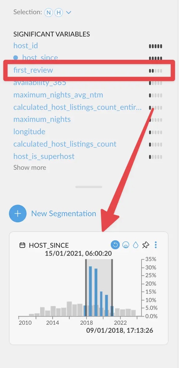 On the other hand, when filtering a bit closer to the end of the range, `first_review`
correlates more strongly instead. Which makes sense, since having a *first review* is the
most common event among new hosts.
We are skipping the two first entries on purpose. Correlations on an ID column (`host_id`)
are generally not useful. And a strong correlation against the same variable is also to be expected.
Graphext evaluates all columns anyways!
## How is the score calculated?
On the other hand, when filtering a bit closer to the end of the range, `first_review`
correlates more strongly instead. Which makes sense, since having a *first review* is the
most common event among new hosts.
We are skipping the two first entries on purpose. Correlations on an ID column (`host_id`)
are generally not useful. And a strong correlation against the same variable is also to be expected.
Graphext evaluates all columns anyways!
## How is the score calculated?
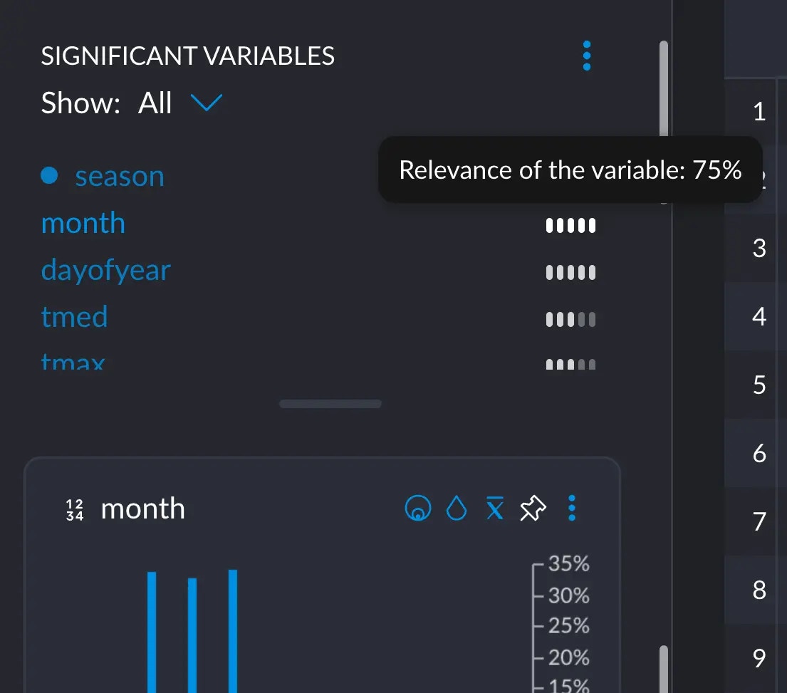
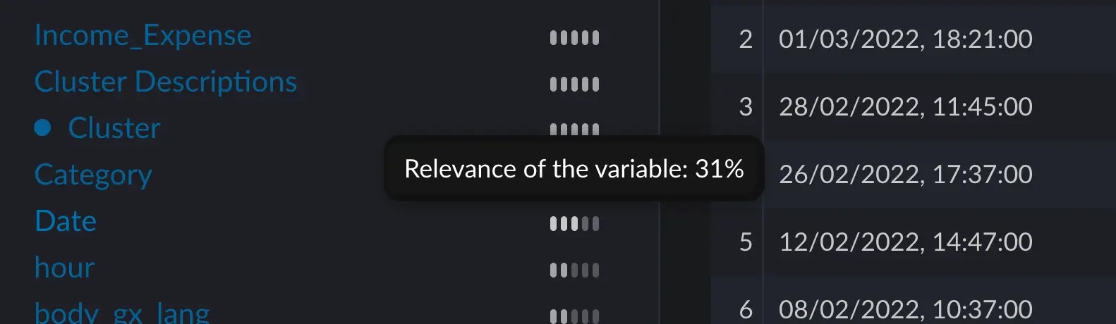 When hovering over the five little bars next to each variable, a score appears. This score tells us how significant the
distribution of this variable is to the distribution of the current selection we've made.
### Manually computing an example
#### Context
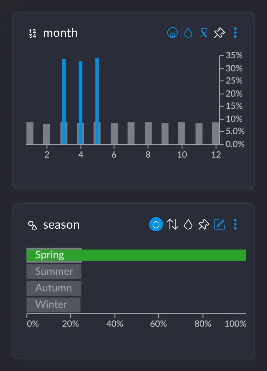
Assume we are on a dataset where, among other things, we have a column `month` which has the numbers 1 – 12 for each month,
and a column `season` which has the values "Summer", "Autumn", "Winter", "Spring".
We all know that Spring happens in March, April and May, approximately. If we select the category "Spring", we can see
that the months 3, 4 and 5 show up these blue spikes, whereas the rest of the months do not.
When hovering over the five little bars next to each variable, a score appears. This score tells us how significant the
distribution of this variable is to the distribution of the current selection we've made.
### Manually computing an example
#### Context
Assume we are on a dataset where, among other things, we have a column `month` which has the numbers 1 – 12 for each month,
and a column `season` which has the values "Summer", "Autumn", "Winter", "Spring".
We all know that Spring happens in March, April and May, approximately. If we select the category "Spring", we can see
that the months 3, 4 and 5 show up these blue spikes, whereas the rest of the months do not.
 If we hover over one of these blue bars in this case, this tooltip informs us of several important figures:
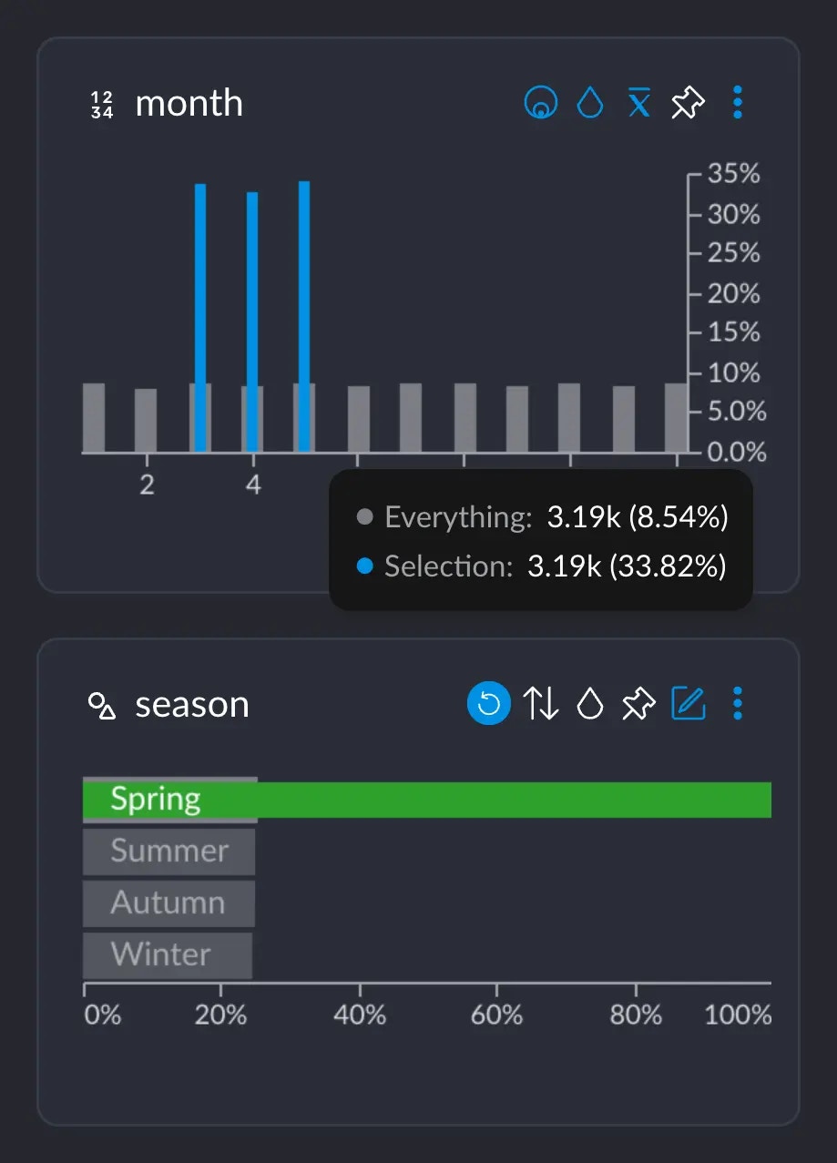 * 3.19K represents the number of rows that have this particular value from this particular column (in this case, the value 5 for column `month`). Or, basically, the grey-ish bar behind the blue one.
* This 3.19K amounts to an \~8.5% of the whole dataset, which has \~37.3K rows.
* Importantly, these 3.19K rows correspond to \~33% of all the 9442 rows we selected when clicking on "Spring". This makes sense: spring spans across 3 months, so May alone has about a third of all the days that comprise the whole Spring.
If we hover over month 6 instead, this shows up:
* 3.19K represents the number of rows that have this particular value from this particular column (in this case, the value 5 for column `month`). Or, basically, the grey-ish bar behind the blue one.
* This 3.19K amounts to an \~8.5% of the whole dataset, which has \~37.3K rows.
* Importantly, these 3.19K rows correspond to \~33% of all the 9442 rows we selected when clicking on "Spring". This makes sense: spring spans across 3 months, so May alone has about a third of all the days that comprise the whole Spring.
If we hover over month 6 instead, this shows up:
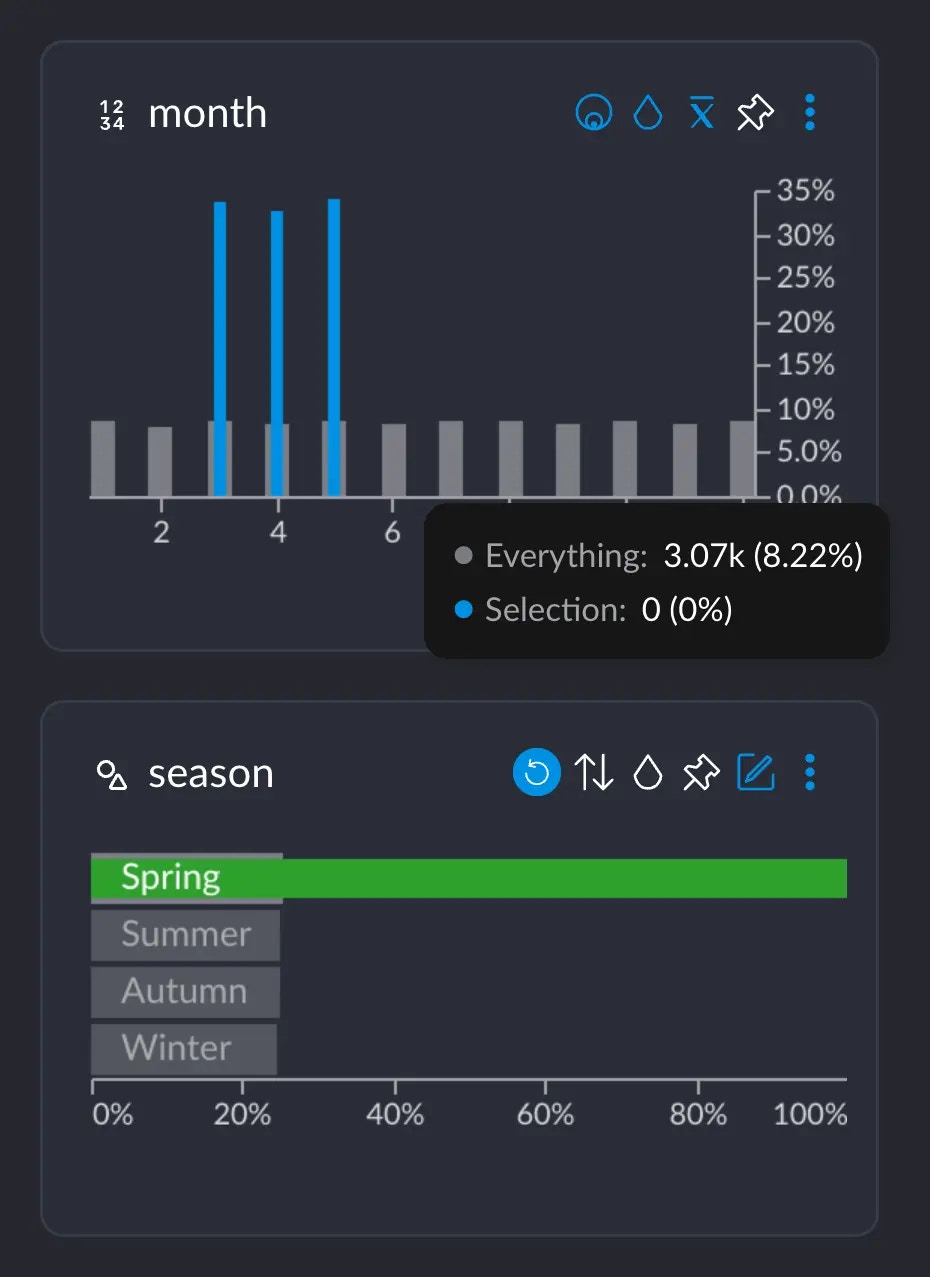 There are \~3.07K rows occurring in June, but 0 that have both the value 6 in `month` AND the value "Spring" in `season`.
#### Computing
The way we calculate how different the distributions between month and season are would involve going over each
of these tooltips, subtracting the two percentage values, getting the absolute value, adding them all up
and finally dividing by two.
The full operation would look like this.
1. We add up all the absolute value of the differences:
$$
\begin{align}
&(8.3 - 0) + (8.3 - 0) + (33.3 - 8.3) \\ &+ (33.3 - 8.3) + (33.3 - 8.3) + (8.3 - 0) \\ &+ (8.3 - 0) + (8.3 - 0) + (8.3 - 0) \\ &+ (8.3 - 0) + (8.3 - 0) + (8.3 - 0) \\ &= 149,7
\end{align}
$$
2. Finally, we divide the whole result by 2:
$$
149.7 / 2 = 74.85 \approx 75
$$
if we hover over `month` in the significant variables section:
There are \~3.07K rows occurring in June, but 0 that have both the value 6 in `month` AND the value "Spring" in `season`.
#### Computing
The way we calculate how different the distributions between month and season are would involve going over each
of these tooltips, subtracting the two percentage values, getting the absolute value, adding them all up
and finally dividing by two.
The full operation would look like this.
1. We add up all the absolute value of the differences:
$$
\begin{align}
&(8.3 - 0) + (8.3 - 0) + (33.3 - 8.3) \\ &+ (33.3 - 8.3) + (33.3 - 8.3) + (8.3 - 0) \\ &+ (8.3 - 0) + (8.3 - 0) + (8.3 - 0) \\ &+ (8.3 - 0) + (8.3 - 0) + (8.3 - 0) \\ &= 149,7
\end{align}
$$
2. Finally, we divide the whole result by 2:
$$
149.7 / 2 = 74.85 \approx 75
$$
if we hover over `month` in the significant variables section:
 We are not justifying the math behind this, since this flies a bit out of the
scope for this short explainer. Check the
[references](/concepts/graphext-concepts/significant-variables#references) if
you really want to dig into the topic.
## Summing up
This computed the distance of the distributions created by your selection and the distributions that are already present
in your data. Each of the different values a variable may have is a distribution on itself that changes when you select
particular rows within your data. Studying these distributions and their differences help us understand our data in better
ways.
### References
The actual calculation that's going on corresponds to the [total variation distance of probability measures](https://en.m.wikipedia.org/wiki/Total_variation_distance_of_probability_measures), for those
interested in the math behind it.
This article: [Is there a difference?](https://www.data8.org/fa15/text/3_inference.html#Total-Variation-Distance) goes into great depth with a practical example calculating and interpreting the result.
We are not justifying the math behind this, since this flies a bit out of the
scope for this short explainer. Check the
[references](/concepts/graphext-concepts/significant-variables#references) if
you really want to dig into the topic.
## Summing up
This computed the distance of the distributions created by your selection and the distributions that are already present
in your data. Each of the different values a variable may have is a distribution on itself that changes when you select
particular rows within your data. Studying these distributions and their differences help us understand our data in better
ways.
### References
The actual calculation that's going on corresponds to the [total variation distance of probability measures](https://en.m.wikipedia.org/wiki/Total_variation_distance_of_probability_measures), for those
interested in the math behind it.
This article: [Is there a difference?](https://www.data8.org/fa15/text/3_inference.html#Total-Variation-Distance) goes into great depth with a practical example calculating and interpreting the result.